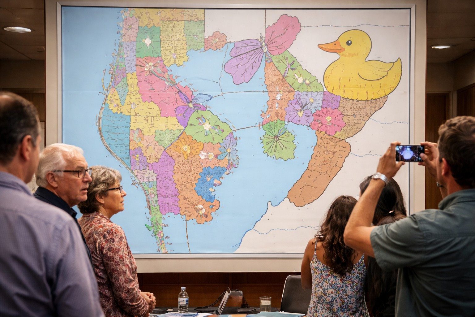
Pinellas and Tampa lawmakers unveiled a newly redrawn district map this week, assuring the public that the unusually shaped boundaries were created purely for aesthetic reasons and absolutely not to siphon votes.
According to officials, the revised map was designed to give each district “its own personality,” resulting in a collection of regions resembling animals, household objects, and what several residents described as “things you notice and then wish you hadn’t.”
“This was about creativity,” said one lawmaker, pointing to a district shaped vaguely like a dolphin. “We wanted something more inviting than boring old rectangles.”
Lawmakers stressed repeatedly that the shapes had nothing to do with party advantage, voter distribution, or electoral outcomes, and instead reflected a commitment to making civics “more fun to look at.”
“If people are going to stare at maps anyway, they might as well enjoy them,” said another official.
However, shortly after the maps were released, members of the public began circulating screenshots of several districts whose shapes were described as “suggestive." One Pinellas resident said, "You know exactly what it looks like, right? You see it."
One district in particular, stretching across multiple counties in a winding, asymmetrical pattern, prompted widespread concern after residents noted it bore a strong resemblance to something no one wanted associated with their polling place.
“I don’t want to vote in whatever that is,” said one resident. “I just don’t.”
Community members also raised questions about why several districts appeared to snake around population centers only to reconnect miles away, forming shapes that lawmakers described as “playful” and critics described as “extremely deliberate.”
Officials dismissed the criticism, explaining that any resemblance to political manipulation was coincidental.
“Sometimes a cute shape just happens to include exactly the right voters,” said a spokesperson. “That’s geometry.”
When asked why multiple districts appeared to avoid certain neighborhoods entirely while stretching long, narrow corridors through others, lawmakers cited “visual balance” and “artistic flow.”
“We’re thinking about composition,” said one map designer. “Negative space. Line movement.”
Despite mounting backlash, lawmakers defended the maps, noting that several districts had already become popular online.


Lorem ipsum dolor sit amet, consectetur adipiscing elit. Suspendisse varius enim in eros elementum tristique. Duis cursus, mi quis viverra.